


Last month, Matt Wiebe announced a collection of new fonts for users with the Custom Design upgrade. In the past, we’ve highlighted blogs using fonts in creative, effective ways, so we wanted to dive into the pool of customized sites again to find more examples of fonts in the wild.
things{we}make
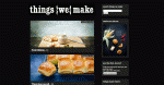
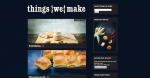
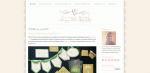
The fonts at Claire Sutton’s blog, things{we}make, are bold and strong, but readable and elegant as well. Claire didn’t want the typefaces to stand out too much. “I wanted the photos to lead the stories, so that the words are just a foil to them,” she says.

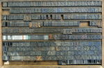
Her font choices complement the design of her custom header (above), created by Jacqui at Print for Love of Wood, a letterpress studio in the United Kingdom. “I asked Jacqui to print ‘Things We Make’ using some of her wooden letters, as I love their quality and texture,” says Claire. She chose this antique typeface:


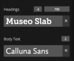
With that design in place, Claire chose Museo Slab as the font for her headings, as it was the closest approximation to the slab serif font in her letterpress header. “I like its bold, clear, unfussy appearance,” says Claire. For the body text, she knew she wanted to contrast Museo Slab with a sans serif font. “Calluna Sans is a humanist, open, and easy-to-read font that works well in white on a black background.”
“The best thing about Custom Design is the ability to try things out until they look right,” says Claire. “I flick through different themes, colors, and fonts to see if I fancy a change, and you can do this without breaking anything — even if you know nothing about code.”
You, too, can test custom fonts in live preview mode. To try it out, go to Appearance → Customize in your dashboard. Claire has written about customizing her blog in more detail, including other CSS tweaks. Check it out!
Tie That Binds
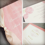
Over at Tie That Binds, Mekala showcases her company, which specializes in custom invitations and styling for weddings. Her blog design is soft and inviting, and the dark text and silver accents contrast her pastel background and pink headlines nicely. Her font, Sorts Mill Goudy, complements the site’s aesthetic, her stationery design, as well as the photographs in her posts:

Image from Tie That Binds
“Sorts Mill Goudy is a revival of the original trusted font, Goudy Old Style. Goudy Old Style was designed in the early 20th century and is a classic, solid, and easy-to-read typeface,” says Mekala. “It’s known to be graceful and balanced, with a few eccentricities — much like the love stories of those for whom we create custom invitations.”
![]()
Sorts Mill Goudy helps tie her site’s design elements together and matches the festive mood and elegance shown in her event styling.
Intoxicology ReportChris Kassel’s Intoxicology Report — a “contra-connoisseur’s guide to wine, beer, and spirits” — has a creative background reminiscent of filed papers and written reports.

Here, he transforms the ever-popular Twenty Ten theme with a bold background and header image designed by his son, Jesse Kassel, and selects Arvo for his headings and body text. Arvo is a geometric slab-serif typeface that’s strong and holds its own against the site’s design, but doesn’t call too much attention to itself, allowing Chris’ thoughts to take center stage:

A few more sites using custom fonts caught our eye — if you’re looking for more ideas and inspiration, read on:
- High Plains Thrifter: Blogger and thrift store shopper Meghan uses the calligraphic font Fertigo Pro Script to dress up the titles of her posts and widgets. Designed by Tabitha Emma, the site is whimsical, crafty, and fun.
- A Quiet Week in the House: Lori writes about Asperger’s and autism as both a parent of an Asperger’s child and as an adult with Asperger’s. She uses Elemin, a premium theme, and keeps her site minimal and clean. Her fonts — Ronnia Condensed for her post titles and PT Serif for her body text — create an easy reading experience, allowing visitors to focus on her content.
- The Blue Hour: The blog of photographer Brian W. Ferry nicely displays his images, while the familiar typewriter-style Courier fonts in his posts creates an almost DIY/documentary feel, as if he’s jotting down notes to accompany his snapshots. He also uses Typekit to display Luxi Sans and Vera Sans for his menu links and tags.
Interested in using custom fonts, too? Check out the Custom Design upgrade, which allows you to tweak your blog with custom fonts, colors, and CSS.
Filed under: Community, Customization, Design, Upgrade, WordPress.com

